Pure CSS Magic: Creating Stylish Modal Windows Without JavaScript
What we are going to do is a modal window that opens in the center of the screen by pressing a link while everything that underlies the window becomes blurred. It can be done by [Dialog element](http://www.whatwg.org/specs/web-apps/current-work/multipage/forms.html#the-dialog-element “Dialog` element”), but these day we don’t need any JavaScript realy to solve this task. Well, there are two main techniques to handle onClick events in CSS – checkbox-hack and selection by :target. The second way binds our modal window to a URL hash. So you can refer to the modal window in URL, what is quite handy. Chris Coyier provided an example of highlighting a text according to :target state in http://css-tricks.com/on-target/. He also noted “jumping” side effect and offered a JavaScript fix. Ian Hansson however made an example of tabbed content widget fixing the effect by setting target anchors in position fixed. That is it. Let’s write now our example HTML. First we need anchors to keep the state of URL hash. One is to open the modal window (id=about) and second is close all windows (id=start). As we do not need real links we can make the anchors of some neutral elements e.g. span.
<span id="start" class="target"><!-- Hidden anchor to close all modals --></span>
<span id="about" class="target"><!-- Hidden anchor to open adjesting modal container--></span>
Next we mark up the modal window:
<div class="modal">
    <div class="content vertical-align-middle">
    <h2>About</h2>
    <article>Lorem ipsum</article>
      <a class="close-btn" href="#start">X</a>
    </div>
</div>
And to show the modal window really blurs underlaying content, we put dummy page HTML in a container (.page-container) below:
<div class="page-container">
  <h1>Lorem ipsum dolor sit amet,</h1>
  <p><a href="#about">Open Modal Window</a> Lorem ipsum dolor sit amet.../p>
</div>
We hide our anchors and set them to fixed position as Ian Hansson proposed.
.target {
  display: block;
  left: 0;
  position: fixed;
  top: 0;
  width: 0;
  height: 0;
  visibility: hidden;
  pointer-events: none;
 }
Then we expand modal window container to fill in all the visible viewport.
.modal {
  position: fixed;
  top: 0;
  right: 0;
  left: 0;
  bottom: 0;
  z-index: 100;
  text-align: center;
  display: none;
  /* Fallback for legacy browsers */
  background-color: rgba(0,0,0,0.6);
}
Note that z-index is expected to be higher than any within .page-container. We need the modal box straight in center of the screen. Since its height initially is unknown we use “vertical centering” trick.
.modal::before {
  content: '';
  display: inline-block;
  height: 100%;
  vertical-align: middle;
  margin: 0;
}
.modal > .content {
   text-align: left;
   display: inline-block;
   background-color: #b13e12;
   box-sizing: border-box;
   color: white;
   position: relative;
   width: 500px;
   padding: 20px;
 }
As you probably noted initially modal window container is hidden. We have to show it when URL hash matches its immediate neighbor anchor (.target).
 /* Behaviour on legacy browsers */
.target:target + .modal {
    display: block;
}
That opening doesn’t look fancy at all. But we can enhance the UX in modern browsers:
:root .modal {
  display: block;
  transition: transform 0.3s cubic-bezier(0.5, -0.5, 0.5, 1.5);
  transform-origin: center center;
  transform: scale(0, 0);
  background-color: transparent;
}
:root .modal > .content {
  box-shadow: 0 5px 20px rgba(0,0,0,0.5);
}
:root .target:target + .modal {
  transform: scale(1, 1);
}
Legacy browsers not supporting CSS3 will ignore any styles prefixed with :root and, therefore, will show up the window without these effects.
What about blurring the page content underlaying the window? We will apply blur filter on .page-container when any modal window anchor’s id (except #start) matches the URL hash.
:root .target:target ~ .page-container {
   filter: blur(5px);
  -webkit-filter: blur(5px);
  filter: url("data:image/svg+xml;utf8,<svg xmlns='http://www.w3.org/2000/svg' ><filter id='blur5'><feGaussianBlur in='SourceGraphic' stdDeviation='5' ></feGaussianBlur></filter></svg>#blur5"); // for Firefox
  filter:progid:DXImageTransform.Microsoft.Blur(PixelRadius='5');
}
:root span[id="start"]:target ~ .page-container {
 filter: none;
 -webkit-filter: none;
}
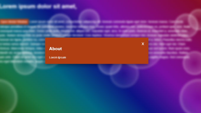
Here what we get:
Enhancing for better user experience
You may be missing some secondary functionality such as closing modals on Esc press or by cliking outside the modal content. We can bring it in with a little of JavaScript:
Fallback for IE8
:target pseudo-selector has a good support among modern browsers, but as you can guess, it is not supported by in IE browsers with versions lesser than 9. Yet we can shim this behaviour by using some JavaScript:
(function( window ){

  var doc = window.document,
      /**
       * Remove .is-expanded from all modals and add it to the target
       * @returns {void}
       */
      shimTargetOnModals  = function() {
        var i = 0,
            len,
            id = window.location.hash.substr( 1 ),
            nextSibling = doc.querySelector( "#" + id + " + .modal" ),
            nodeList = doc.querySelectorAll( ".target + .modal" ),
            len = nodeList.length;

        // Close all other modals
        for ( ; i < len ; i++ ) {
          nodeList[ i ].className = "modal";
        }
        // Expand requested window
        if ( nextSibling ) {
          nextSibling.className = "modal is-expanded";
        }
      };

  window.attachEvent( "onload", function(){
    window.attachEvent( "onhashchange", shimTargetOnModals );
    shimTargetOnModals();
  });


}( window ));
It requires some additional styles:
.modal.is-expanded {
   display: block;
}
.modal.is-expanded > .content {
  top: 50%;
  margin-top: -45px;
}