Refactoring Legacy React Code: Moving from OOP to Functional Components
Back in 2019, when Hooks were introduced with React 16.8, I didn’t expect we would truly switch to functional components. At that time, much of my code simply couldn’t be migrated to functional components without sacrificing flexibility and maintainability. However, as the React ecosystem matured, new possibilities arose. In this article, I’d like to share some tricks I discovered while refactoring old class-based code.
The Old Object-Oriented Approach
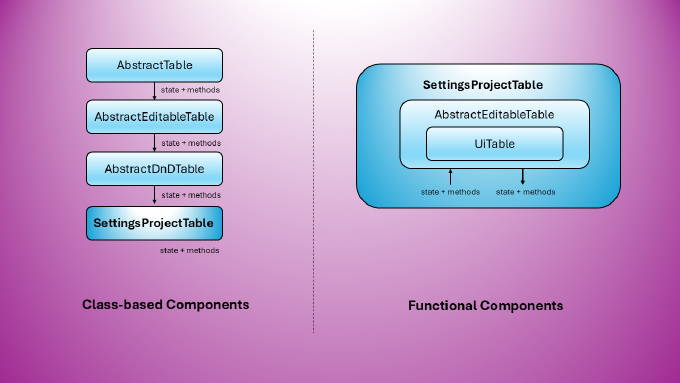
Previously, I followed a traditional object-oriented approach. For example, all table-related components inherited from AbstractTable, either directly or through derivatives like AbstractEditableTable and AbstractDnDTable.
AbstractTablehandled core UI table functionalities, such as sorting, filtering, and pagination via a REST API client.AbstractEditableTableadded inline editing capabilities.AbstractDnDTableintroduced drag-and-drop row functionality.
This approach allowed concrete table components to remain thin while still being highly customizable at every level. Let’s look at an example:
AbstractTable.js
export default class AbstractTable extends React.Component {
  //...
  renderActions = ( text, record ) => (
	<a href="#" onClick={ () => this.removeRecord( record.id ) }>Delete</a>
  )

 removeRecord( id ) {
    this.api.remove( id );
    this.fetch();
  }
  //...

}
SettingsProjectTable.js
export default class SettingsProjectTable extends AbstractTable {

  constructor( props ) {
    super( props );
    this.api = api;
    this.state = {
      columns: [{
        title: "Name",
        dataIndex: "name",
        sorter: true
      },
      {
        title: "Actions",
        key: "action",
        render: this.renderActions
      }]
    }
  }

};
By design, most tables include a column for row-specific actions. In this example, the default renderActions function in AbstractTable simply renders a link to remove a row. If a table doesn’t require actions, we omit the corresponding column metadata. For common cases, we can reuse the default function, while for special cases, we can override it with a custom render function, accessing methods from AbstractTable (or any parent class):
SettingsProjectTable.js
	renderActions = ( text, record ) => (
		<span>
		  <Link to={ `${ this.url }/${ record.id }` }>Edit</Link>
		  <Divider type="vertical" />
		  <Popconfirm placement="topRight" title="Are you sure to delete this record?"
			onConfirm={ () => this.removeRecord( record.id ) } okText="Yes" cancelText="No">
			<a href="#">Delete</a>
		  </Popconfirm>
		</span>
  )
Since removeRecord is in the same scope, accessing it is straightforward. Additionally, we can hook into the component’s lifecycle by overriding componentDidMount:
SettingsProjectTable.js
	async componentDidMount() {
		await super.componentDidMount();
		// extra functionality
	}
Moving to Functional Components
With functional components, we embrace composition over inheritance. Instead of extending AbstractTable, AbstractEditableTable, and AbstractDnDTable, we split functionality into separate components. Passing state from a parent to a child is easy, but what about communication in the opposite direction?
Consider FooTable, which relies on UiTable for base table functionality. Passing a column metadata object from FooTable to UiTable is simple. However, if we need to define a custom render function for row actions, we must access UiTable methods, such as removeRecord. We can achieve this using useImperativeHandle:
UiTable.js
import React, { forwardRef, useImperativeHandle } from "react";

const UiTable = forwardRef(({ columns, api, baseUrl, prefetchedData }, ref ) => {

	// Expose method to the the calling component
    useImperativeHandle( ref, () => {
        return {
            removeRecord
        };
    }, []);

	return <>...</>;

});

export default UiTable;
FooTable.js
import { useRef } from "react";

export default function FooTable( props )  {

  const ref = useRef( null ),
	    columns = [
		   ...OTHER_COLUNS,
			  {
				title: "Actions",
				key: "action",
				width: "120px",
				render: renderActions
			  }
		];

	function renderActions( text, record ) => (
		<span>
		  <Popconfirm placement="topRight" title="Are you sure to delete this record?"
			onConfirm={ () => ref.current.removeRecord( record.id ) } okText="Yes" cancelText="No">
			<a href="#">Delete</a>
		  </Popconfirm>
		</span>
	)

  return <UiTable columns={ columns } api={ api }  ref={ ref } { ...props } />;

};
Here, useImperativeHandle exposes child component methods, allowing the parent to access them via ref. Unlike class-based components, we can’t override child methods, but we can allow the child component to accept a customization function via props:
UiTable.js
const UiTable = forwardRef(({ columns, api, baseUrl, prefetchedData, footer = null }, ref ) => {

	const renderFooter = footer ?? () => {
		// render the default footer
	};
});
Another Way of Lifting State from Child to Parent
Another challenge was refactoring forms while maintaining a common UiForm for base functionality. UiForm extends Ant Design’s Form, handling validation, submission, and data fetching. Ant Design’s <Form> component follows this structure:
<Form { ...config } >
    <Form.Item
      label="Name"
      name="name"
      rules={[]}
    >
	<Form.Item
      label="Name"
      name="name"
      rules={[]}
    >
	...
</Form>
In our case, <Form> belongs to UiForm, while the specific <Form.Item> combinations are defined in FooForm. To achieve this, we pass a function as the children prop, granting access to the child component’s scope:
UiForm.js
export default function UiForm({ children }) {
	// ...
	const onKeyDown = () => {
		// ...
	},
	[ initialValuesLoaded, setInitialValuesLoaded ] = useState( false );

	return <Form form={ form }
            layout="vertical"
            initialValues={ initialValues }
            scrollToFirstError={ true }
            onFinish={ ( values ) => {
              setLoading( false );
              submit( pkInt, values );
            }}
            onFinishFailed={ () => setDisabled( true )  }
          >
            { errorMessage ? <Alert
                 description={ errorMessage }
                 type="error"
               /> : null }

            { children({ form, onKeyDown, initialValuesLoaded }) }


          </Form>;
}
FooForm.js
export default function FooForm({ api }) {
	// ...

	const generateSlug = ( form ) => {
		const src = form.getFieldValue( "title" );
		src && form.setFieldValue( "slug", normalizeSlug( src ) );
	 }

	return <UiForm { ...config }>

     {({ onKeyDown, form, initialValuesLoaded }) => ( <>
          <FormItem  label="Title"  name="title">
              <Input onKeyDown={ onKeyDown } />
          </FormItem>

		  <FormItem label="Slug"  name="slug"
			  extra={<a onClick={ () => generateSlug( form ) }>Generate from the name</a>}>
              <Input  onKeyDown={ onKeyDown }  />
          </FormItem>

	  </UiForm>;
}
As shown, we receive the UI library’s form instance (form) and gain access to the Ant Design Form API. We also pass down a shared method, onKeyDown, for use in input components.
Conclusion
Refactoring class-based components into functional ones can be challenging, especially when dealing with inherited behaviors. However, by leveraging composition, useImperativeHandle, and function-based customization patterns, we can achieve the same level of flexibility while fully embracing React’s modern best practices.
I hope these techniques help you as you transition your own projects to functional components!