Mastering HTML5 Forms: Validation, Inputs, and Beyond
Since the very beginning of HTML there were no much of changes regarding forms until recently. Yet, there was an attempt to bring a new API with XForms, but it was never really supported by any of major browsers. Now we have a comprehensive consistent Form API which allows us to create full-fledged forms even with not help of JavaScript. Everything sounds so exciting until you try to use HTML 5 Forms on real projects. The API itself, new input types, attributes, elements are currently supported by browsers to varying degrees. It means when Chrome 25 and Opera 12 render date picker widget for input of date type, Firefox 18 just ignores it and IE < 10 has no idea of the API at all. Nevertheless you can do with graceful degradation on older browsers. IE will treat new input types (email, tel, url, search, color, number, range, date) as text input, ignoring new attributes (required, placeholder, autofocus and so on). So it’s still functional, just defiled. Another concern you inevitable run into is that different browsers render UI components differently. It was always a problem even with simple elements as button and checkbox, but we got used to solve it with CSS. Now you can style some components (e.g. placeholder, validation bubble message) by using vendor-specific (non-standardized) pseudo-classes (::-webkit-input-placeholder, :-moz-placeholder, ::-webkit-validation-bubble-message). But that’s rather a hack, which is not quire reliable (e.g. Opera doesn’t support styling of neither placeholder nor validation bubble message). Besides, there is no way to style complex widget such as date picker, color picker or even slider (range control). HTML 5 Form looks like a titbit, which you cannot take for it’s not yet fully ready. But I want it anyway. That makes me think of a custom HTML5 Form API handler, which can treat forms alike on any browser.
Polyfill
Here comes HTML5 Form Shim jQuery plugin. In the simple use-case the plugin shim all the forms available on DOM-is-ready event. The forms work as intended on new browsers, but for the older ones the plugin takes care. You just have to alias pseudo-classes :focus, :invalid, :valid in your CSS with regular classes focus, invalid, valid, because legacy browsers will simply ignore the first ones. But how it really works? Let’s take the following form example:
<form class="example1">
    <label for="name">Name:</label>
    <input type="text" placeholder="Name" required="true" name="name"  />
    <label for="email">Email:</label>
    <input type="email" placeholder="Email" autofocus="true" required="true" name="email" />
    <label for="name">Age:</label>
    <input type="number" required="true" name="age" min="18" max="100" />
    <label for="email">Promo code:</label>
    <input type="text" name="promocode" required="true" pattern="[A-Z]{3}[0-9]{4}"
title="Promo code consist of 3 uppercase letters followed by 4 digits." />
    <label for="email">Tel:</label>
     <input type="tel" name="tel" required="true" pattern="^\+(?:[0-9] ?){6,14}[0-9]$"
title="Please enter valid tel." />
    <button type="submit">Submit</button>
</form>
Here some styling:
::-webkit-input-placeholder,
:-moz-placeholder {
    color: #CCC;
}

form input.placeholder,
form textarea.placeholder {
    color: #CCC;
}

input.required,
input.valid,
input.invalid {
    background-image: url("./field-marks.png");
    background-repeat: no-repeat;
    background-position: 280px 7px;
    background-color: transparent;
}

input:valid,
input:required,
input:focus:invalid {
    background-image: url("./field-marks.png");
    background-repeat: no-repeat;
    background-position: 280px 7px;
    background-color: transparent;
}

input:required {
    background-position: 280px 0px;
}
input:valid {
    background-position: 280px -32px;
}
input:focus:invalid {
    background-position: 280px -64px;
}

input.required {
    background-position: 280px 0px;
}

input.valid {
    background-position: 280px -32px;
}

input.focus.invalid {
    background-position: 280px -64px;
}

/* Get rid of Firefox red glow */
:-moz-ui-invalid,
:invalid,
:-moz-submit-invalid {
    box-shadow: none;
}
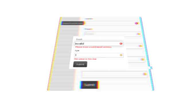
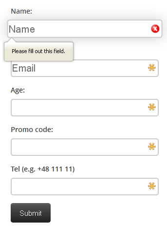
First we make sure placeholder text will look alike in Firefox, Chrome, Safari and legacy browsers. Then we want our form to mark the required inputs with asterisk icon and valid and invalid ones with “ok” and “fail” icons respectively. However :invalid pseudo-class will trigger immediately on all the required form inputs, because initially they are empty. It would be confusing like “Hey form! Give me a chance to fill the fields in first”. Firefox provides a pseudo-class :-moz-submit-invalid just for the case. But what about other browsers? We can turn the input into invalid state only when it’s invalid on focus. So initially all the required fields marked with asterisk. When you start typing it may change to valid or invalid state. On submit it focuses on the first invalid field if there are any and displays validation bubble message (tooltip). Let’s try it now. Leave the form empty and submit. You’re going to have a screen like that in Firefox:
In IE 8

The second browser doesn’t support HTML5 Forms. So it shows a degraded form, but still validates required fields.
Now we type invalid value to the email field. It turns to invalid state immediately and back to valid state as soon as we change the value to valid one.

For the “Age” input the form checks not only if the given value is a number, but if it lies within the defined range (min:18 and max:100). The “PromoCode” input is validated against the defined regexp pattern and on fail shows validation message given in title attribute.
You can access The constraint validation API with jQuery selector on both new and legacy browsers. E.g. $(“input”).checkValidity() will give true or false depending of the input state, $(“input”).validationMessage will contain the validation message text on invalid state.
Custom Form Handler
As I mentioned above different browsers render form UI components differently. So how can we bring some cross-browser consistency into our form appearance? Basically we can just force the HTML5 Form Shim plugin to handle form custom on any browser by declaring data-custom-validation attribute (data-custom-validation=“true”). While having this attribute set for the pervious example you will get on submit event the same validation bubble message in Firefox, Chrome, Opera and slightly degraded in old IE. Moreover, you can style the message for your taste. Just override the default helper:
$.setCustomValidityCallback = function( error ) {
       var pos = this.position(),
            tooltip = $( '<div class="tooltip tooltip-e">' +
                '<div class="tooltip-arrow tooltip-arrow-e"></div>' +
                 '<div class="tooltip-inner">' + error + '</div>' +
            '</div>' ).appendTo( this.parent() );
           tooltip.css({
                 'top', pos.top - ( tooltip.height() / 2 ) + 20,
                 'left', pos.left - tooltip.width() - 12
           });
            global.setTimeout( function(){
                 tooltip.remove();
            }, 2500 );
    };
That’s fine, but what if I want validation message inline? Of course you can tune $.setCustomValidityCallback helper respectively. But there is an easy way. You can bind any container by using attribute data-validation-message-for (data-validation-message-for="
<form class="example2" data-custom-validation="true">
	<label for="email">Email:</label>
	<input id="f2email" type="email" placeholder="Email" required="required" name="email" />
	<div class="help-inline">
		<div data-validation-message-for="f2email"></div>
	</div>
	<label for="name">Age:</label>
	<input id="f2age" type="number" required="required" name="age" min="18" max="100" />
	<div class="help-inline">
		<div data-validation-message-for="f2age"></div>
	</div>
	<button class="btn btn-inverse btn-large" type="submit">Submit</button>
</form>

What about styling complex UI components like date picker, color picker, slider? Most of the HTML5 Form polyfills provide built-in widgets. I don’t want to restrict you with any concrete implementation. On the contrary you can pretty easily attach to an input type whatever widget implementation you like. Please, find below an example of jQuery UI data picker binding.
/**
 *  Custom date picker for input[type="date"]
 *
 *  @param string Input type (here Date for <input type="date">)
 *  @param string Input value validation message
 *  @param function Validation callback (returns boolean)
 *  @param function Initialization callback
 */
$.setCustomInputTypeValidator( "Date", "Please enter a valid date", function() {
    var pattern = /^\d{2,4}(-|\/)\d{2,4}(-|\/)\d{2,4}$/i;
    return !$( this ).val() || pattern.test( $( this ).val() );
}, function( control ) {
    control.isShimRequired() %26%26
    control.degrade().boundingBox.datepicker();
});

control.isShimRequired() implies that the widget required either when the form requested on a legacy browser or if custom mode set (data-custom-validation attribute). control.degrade() changes the type of input to text, which prevents collisions with native browser renderer in custom mode. It is a chainable method, so you can reach control. boundingBox – the elements itself, which is also available as the context of function ($( this )).
Initialization callback is optional, so if you want just a custom validator with no widget attached it will as easy as that:
$.setCustomInputTypeValidator( "Zip", "Please enter a valid zip code", function() {
    var pattern = /^[0-9]{6,8}$/;
    return pattern.test( $( this ).val() );
});
Additional readings
- W3C Specification
- Making Forms Fabulous with HTML5
- HTML5 forms introduction and new attributes
- A Form of Madness
- The Current State of HTML5 Forms
- Creating Cross Browser HTML5 Forms Now, Using modernizr, webforms2 and html5Forms