Leveraging HTML5.2 for More Functional and Interactive Web Apps
What do you do when you need a widget-like functionality? At the present there is a whole generation of developers who with as a rule are googling for ready-made jQuery plugin. Can’t we do better than that? With advance of web-components we are expected to compose UIs from these building blocks. They are many. One can find one for almost any task. They are highly customizable. One can reuse the functionality, but with own original representation. They are isolated. One doesn’t need to worry about the collisions in the compound system. But in reality the APIs required by true web-component have yet poor support in user-agents. One has to load an emulator library like Polymer. When it comes to component-based frameworks, one can painlessly import a component or rather go with a set like Material UI . But what would you say about standardized, library/framework-agnostic solution with not dependencies? Interesting that with HTML 5.1 and HTML 5.2 we get a number of new functional elements, solving classical developer tasks such as dialog, expandables, date picker and others. At the title of writing the support of the spec among he browsers isn’t that good, but the elements can be polyfilled where it lacks. Let’s see what’s available and how we can use it.
Expandables with summary/details
Pair of elements details and summary was introduced in HTML 5.1 and now widely supported. They implements a disclosure widget that can be adopted for collapse, dropdown menu, tree navigation and other tasks. By default any child elements of details except summary are hidden. As one clicks at summary, property open of details changes to true and the hidden content gets in view. To put it in practice we make the following HTML:
<details>
  <summary>Lorem ipsum dolor sit amet</summary>
  <p>Lorem ipsum dolor sit amet, consectetur adipiscing elit. Vestibulum sollicitudin, justo eu consequat rutrum, leo tellus euismod quam, et consectetur nibh nunc vitae risus. Vestibulum auctor nunc dolor, et hendrerit elit aliquet at. Nulla urna odio, elementum eget ligula sit amet, finibus ullamcorper nibh. Mauris a magna purus. Curabitur sit amet massa vitae odio cursus convallis. Morbi vel dapibus orci. Integer sed arcu varius, sollicitudin est quis, rhoncus justo. Etiam feugiat purus nibh, vel consequat velit posuere eget. Fusce ullamcorper fringilla sapien eu sodales. Cras ipsum odio, vulputate a massa id, efficitur tempor ante.  </p>
</details>

<details>
  <summary>Lorem ipsum dolor sit amet</summary>
  <p>Lorem ipsum dolor sit amet...  </p>
</details>
As we hit the summary of the first block we get the content of the inner paragraph (Lorem ipsum dolor sit amet..):

It looks already fine, but still we want to customize the look & feel. I suggest to add into reset styles the following lines:
summary {
  display: block;
  cursor: pointer;
  outline: 0;
}

summary::-webkit-details-marker {
  display: none;
}
By applying ::-webkit-details-marker pseudo selector we remove the default marker symbol. That works for Chrome and Safari. As for the Firefox the rule display: block; assigned on summary selector does the trick. Actually the browser doesn’t render the symbol if the box model set different from display: list-item. But keeping these styles we encourage the dev-team never go with the default marker.
Now we are going to play a bit with styles to make it look nicer:
.expandable--default {
  padding: 0.8rem 0;
  border-bottom: 1px solid gray;
}
.expandable--default[open] > summary::before {
  content: "▽";
}
.expandable--default summary {
  cursor: pointer;
  position: relative;
  outline: 0;
  font-size: 1.8rem;
  line-height: 2rem;
  padding-left: 2rem;
}
.expandable--default summary::before {
  content: "▷";
  position: absolute;
  left: 0;
  top: 0;
  display: inline-block;
}
We declare expandable–default implementation of expandable abstract class in terms of PCSS. This class we will be using to refer an expandable of default type. We do not have a class for summary and make the selectors tag-dependent. In this case it won’t be a problem as the functionality itself strictly bound to these elements. You just cannot switch to other tags without breaking the widget behavior. So we extend summary with pseudo-element representing the marker in default state (summary::before with right arrow). When the details content is visible (.expandable–default[open] > summary::before) we change the content of the pseudo-element with down arrow. Now we can apply the styles to the HTML:
<details class="expandable expandable--default">
  <summary>Lorem ipsum dolor sit amet</summary>
  <p>Lorem ipsum dolor sit amet...  </p>
</details>

<details class="expandable expandable--default">
  <summary>Lorem ipsum dolor sit amet</summary>
  <p>Lorem ipsum dolor sit amet...  </p>
</details>
Now it looks notably better:

Why not give it some animation?
.expandable--default[open] > summary::before {
  transform: rotate(90deg);
}

.expandable--default summary::before {
  //...
  transition: transform 200ms;
  will-change: transform;
}
We made the marker-arrow rotating from rightward position to backward one.
See the Pen Expandable made with summary/details elements of HTML5.1 by Dmitry Sheiko (@dsheiko) on CodePen.
What about some other use case? Here is a codepen https://codepen.io/dsheiko/details/MvEpXm/ with tree navigation based on details/summary

See the Pen Tree-nav based on details/summary by Dmitry Sheiko (@dsheiko) on CodePen.
Polyfill
In case any of your users still using IE you can polyfill the elements with https://github.com/javan/details-element-polyfill
Modal dialogs
Modal dialogs are used by almost every application. For a simple dialog we can go without any JavaScript at all. For advanced one we apply plain JavaScript or UI library or even environment integration API. Since version 5.1 HTML extended with a new element dialog. It has method showModal that shows the contents of the elements in a modal window. If you supply an URL to the method it will load the referred external document. One can call method close to hide the modal. With attribute open one can make the modal visible by default:
<dialog open>
  <p>Lorem ipsum dolor sit amet</p>
  <button  id="close">close</button>
</dialog>

<script>
    const dialog = document.querySelector( "dialog" ),
          closeBtn = document.querySelector( "#close" );

    closeBtn.addEventListener( "click", e => dialog.close(), false );
</script>
What is more, if you have within dialog a form with attribute method set to dialog. The form submittion e.g. by pressing submit button would close the dialog. Let’s take some practice to get a better grip on it:
.btn {
  cursor: pointer;
}
.input {
  width: 100%;
  font-size: 1.6rem;
  padding: 0.4rem 0.8rem;
  margin: 0.8rem 0;
}

.dialog-default::backdrop { /* native */
  background: hsla(0,0%,6%,.97);
}
.dialog-default + .backdrop { /* polyfill */
  background: hsla(0,0%,6%,.97);
}
.dialog {
 // abstract class
}
.dialog-default {
  max-width: 400px;
  margin: 0 auto;
  padding: 6rem 4rem;
  border-radius: .4rem;
  background: #222729;
  background-image: radial-gradient(circle at 50% 0,#2e3437,#1d2223);
  box-shadow: 0 0 .1rem rgba(0,0,0,.3);
  color: white;
  text-align: center;
  border: 0;
  position: relative;
}

.dialog-default .btn-close {
  position: absolute;
  top: 1rem;
  right: 1rem;
  border: 0;
  background: transparent;
  color: white;
  font-size: 1.8rem;
  outline: 0;
}
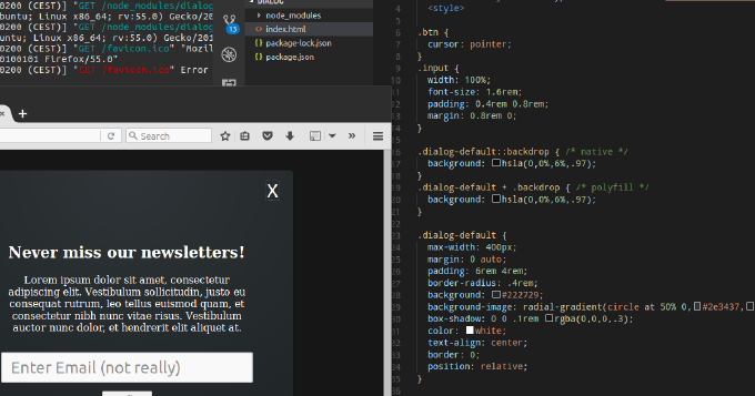
Here we set our styles for the dialog. We use ::backdrop pseudo-selector to access dialog underlay (+ .backdrop the same for the Google polyfill). Within dialog we place close button aligned to right-top corner. Now we can make HTML:
<button id="show" class="btn"  title="Show dialog">Show dialog</button>
<dialog class="dialog dialog-default">
  <button  id="close" class="btn btn-close" title="Close dialog">X</button>
  <h2>Never miss our newsletters!</h2>
  <p>Lorem ipsum dolor sit amet, consectetur adipiscing elit. Vestibulum sollicitudin, justo eu consequat rutrum, leo tellus euismod quam, et consectetur nibh nunc vitae risus. Vestibulum auctor nunc dolor, et hendrerit elit aliquet at.</p>
  <form method="dialog">

    <input class="input" placeholder="Enter Email (not really)" />

    <button type="submit">Confirm</button>
  </form>
</dialog>
Here we have “Show dialog” button and the dialog with close button, header, paragraph and a form. The form comprises submit button. Next goes JavaScript:
const dialog = document.querySelector( "dialog" ),
      showBtn = document.querySelector( "#show" ),
      closeBtn = document.querySelector( "#close" );

showBtn.addEventListener( "click", e => dialog.showModal(), false );
closeBtn.addEventListener( "click", e => dialog.close(), false );
We subscribe a handler for click event on show button, which calls showModal. Similarly we call close method in a handler subscribed for click on close button.
See the Pen Modal window with dialog element of HTML 5.1 by Dmitry Sheiko (@dsheiko) on CodePen.
Polyfill
The element is currently supported by Chrome and Opera, and under consideration in Microsoft Edge. So you may need a polyfill. Lucky to us Google made one - https://github.com/GoogleChrome/dialog-polyfill . What you need to do is simply include its styles and JavaScript into the document
<link rel="stylesheet" type="text/css" href="./node_modules/dialog-polyfill/dialog-polyfill.css" />
<script src="./node_modules/dialog-polyfill/dialog-polyfill.js"></script>
and register dialog elements of the DOM tot he polyfill:
<script>
    Array.from( document.querySelectorAll( "dialog" ) )
      .map( el => dialogPolyfill.registerDialog( el ) );
</script>
Responsive Images
RWD is nothing new. We write a lot of media queries in the CSS nowadays. And you probably know that when it comes to images HTML now allows us setting queries on element level. With srcset attribute of img element and picture/source elements we can fully control the user agent would render for an image depending on a case.
We can make img element to load different (e.g. by size) images depending DPI (Retina aspect):
<img srcset="img/low-res.jpg 1x, img/high-res.jpg 2x, img/ultra-high-res.jpg 3x" alt="…">
We can load different (e.g. by size) images depending on the current viewport size:
<img
  srcset="img/medium.jpg 375w,
          img/large.jpg 480w,
          img/xl.jpg 768w"
  alt="…">
We can even control the image displayed size according to viewport:
<img
  sizes="(min-width: 40em) 80vw, 100vw"
  srcset="img/medium.jpg 375w,
          img/large.jpg 480w,
          img/xl.jpg 768w"
  alt="…">
With picture element it even easier to set the rules. Inside it we declare img with the default source and then provides sources for every case. Element picture supports attribute srcset and has extra one media to set media queries:
<picture>
  <source srcset="img/xl.jpg" media="(min-width: 1000px)">
  <source srcset="img/large.jpg" media="(min-width: 800px)">
  <img srcset="img/medium.jpg" alt="…">
</picture>
So the element represented by picture will load the image from a source with best matching media query. If none found it will simply render the image from the default one. That’s handy as we can the same way make the image fallback to the default source if it fails to load an alternative format .e.g WebP:
<picture>
  <source type="image/webp" srcset="images/butterfly.webp">
  <img src="images/butterfly.jpg" alt="a butterfly">
</picture>
Polyfill
I’m using for quite a time Picturefill polyfill and quite happy with it.
Input types - month, week, datetime and datetime-local
Datepicker is one of most used widgets. So it quite logic that it gets built-in in user-agents. Since HTML 5.1 we get new input types to select week, month and local date time:
<input type="week" />
<input type="month" />
<input type="datetime-local" />

At the moment it’s supported only in Chrome. I could not find a decent polyfill for week and month types. And the one I found for datetime-local https://github.com/jonstipe/datetime-local-polyfill has ugly dependencies to jQuery, jQuery UI, and Modernizr. It is still worth on mentioning:
<html lang="en">
  <head>
    <link rel="stylesheet" href="https://ajax.googleapis.com/ajax/libs/jqueryui/1.8.1/themes/base/jquery.ui.all.css" />
    <link rel="stylesheet" href="datetime-local-polyfill.css" />
    <script type="text/javascript" src="https://ajax.googleapis.com/ajax/libs/jquery/1.7.2/jquery.min.js"></script>
    <script type="text/javascript" src="https://ajax.googleapis.com/ajax/libs/jqueryui/1.8.1/jquery-ui.min.js"></script>
    <script type="text/javascript" src="https://cdnjs.cloudflare.com/ajax/libs/modernizr/2.8.3/modernizr.js"></script>
    <script type="text/javascript" src="datetime-local-polyfill.js"></script>
  </head>
  <body>

<form>
  <input type="datetime-local" name="myDateTimeLocal0" value="2017-09-14T12:00" min="2016-01-01T12:00" max="2018-01-01T12:00" />
</form>

</body>
</html>

Menu and menuitem
With HTML 5.1 were introduced elements menu and menuitem to build a content menu:
<a contextmenu="popup-menu">
  Right click here for the context menu.
</a>

<menu type="context" id="popup-menu">

  <menuitem type="command" label="Command" onclick="alert('Run action')">Action</menuitem>
  <menuitem type="radio" name="group1" checked="true">Radio button 1</menuitem>
  <menuitem type="radio" name="group1">Radio button 2</menuitem>
  <menuitem type="checkbox" disabled>Disabled menu item</menuitem>
</menu>
It’s still supported in Firefox:

However in HTML 5.2 this feature is considered at risk. So I would not recommend you to use it yet.