Building an Awesome Image Preview with LQIP
Images in HTML, what could be easier? However when you have many of them on a page, they do not appear immediately. That depends on caching strategy and bandwidth, but still if you don’t take a special care it may look quite ugly. Basically we need to fill in the slots with something appropriate while images are loading. In other words we need placeholders. Probably the most prominent technique here is LQIP (low quality image placeholder). It was adopted by Google, Facebook, Pinterest, Medium and others. The idea is to load page initially with low quality images and once the page is fully loaded replace them with full quality ones. As placeholder one can use embedded transparent SVG, spinner animated image, solid color, blurred and minified original image. But even more, with modern tools we can do something really fancy. For example, we can use images shape or silhouette as a placeholder. Moreover, we can generate Data-URLs with desired effect during the build and address from IMG tag.
The basics
Let’s get there step by step. First we come back to the basics. HTML IMG tag didn’t change much for last 30 years:
<img alt="Lorem ipsum" src="./img/test.jpg" />
Yet , we have now srcset attribute to tackle responsive web design:
<img srcset="./img/test-1x.jpg 1x,
             ./img/test-2x.jpg 2x"
     src="./img/test.jpg" alt="Lorem ipsum" />
Here we enlist image sources per display density (1x, 2x). Thus browser will load double sized version (test-2x.jpg) on Retina devices. Or we can be more specific:
<img srcset="./img/test-320w.jpg 320w,
             ./img/test-480w.jpg 480w,
             ./img/test-800w.jpg 800w"
     src="./img/test.jpg" alt="Lorem ipsum" />
Now we specify image source width (320w, 480w, 800w) and browser will use that information to pick the most suited source. Note that we still use src attribute to specify fallback source, which will be used by legacy browsers.
Now, to the point. What can we do to beautify image loading? The simplest thing is to add an animated spinner as background for image slots. So while image are loading we see the animation. As the loading completed, we see the images covering the background.
But what if some images fail to load? Diverse browsers render “broken” images differently, but equally awful. To fix it you can target some of them with CSS. However, most universal way, I assume, is to use JavaScript:
Array.from( document.querySelectorAll( "img:not(.is-processed)" ) ).forEach( img => {
    img.classList.add( "is-processed" );
    img.addEventListener( "error", () => {
      img.style.opacity = 0;
    }, false );
  });
Lazysizes
Alternatively we can go with a loader library Lazysizes to achieve better perceived performance. It unlocks new options. For example, we can achieve empty image placeholder like that:
<img
  src="./img/test-fallback.jpg"
  srcset="data:image/gif;base64,R0lGODlhAQABAAAAACH5BAEKAAEALAAAAAABAAEAAAICTAEAOw=="
	data-srcset="./img/test-320w.jpg 320w,
        ./img/test-480w.jpg 480w,
        ./img/test-800w.jpg 800w"
	data-sizes="auto"
	class="lazyload" />
Thus the browser will show the embedded placeholder (transparent or low quality image) until it loads an image corresponding to the viewport from data-srcset.
Lazysizes adds lazyloaded CSS class to image element on load event and that we can use, for an instance, to implement blur-up placeholder:
<style>
	.blur-up {
		-webkit-filter: blur(5px);
		filter: blur(5px);
		transition: filter 400ms, -webkit-filter 400ms;
	}

	.blur-up.lazyloaded {
		-webkit-filter: blur(0);
		filter: blur(0);
	}
</style>
<img src="./img/test-lqip.jpg" data-src="./img/test.jpg" class="lazyload blur-up" />
So the low quality image (test-lqip.jpg) will be blurred until the original image (test.jpg) loaded.
In the article How to use SVG as a Placeholder, and Other Image Loading Techniques you can find insights of LQIP techniques with drawing effect, based on shapes and silhouettes. Why not put it in practice? So we have to generate a low-quality image, precisely, a Data-URL with SVGO and specify it in src or srcset attribute of IMG tag, while full-quality image sources we set in data-srcset, pretty much as we examined above. The most convenient way to achieve it would be with Webpack. The tool transforms imported images during the build. So we can refer the result (e.g. generated SVGO) straight in the application code. Let’s see in practice.
First, we install dependencies:
npm i -S lazysizes react react-dom
As you see we are going to use lazysizes library and React.js.
Now it’s the turn to install developer dependencies. We start with babel packages:
npm i -D @babel/cli @babel/core @babel/node @babel/preset-env @babel/preset-react babel-loader
And Webpack ones:
npm i -D webpack webpack-cli clean-webpack-plugin file-loader image-webpack-loader
The file-loader plugin makes Webpack resolving imports of images and image-webpack-loader optimizes imported
As we have dependencies, we can create base webpack configuration for React.js/Babel application. We put in “src/img” test-1x.jpg and double-sized test-2x.jpg demo images and to src/index.jsx the entry script:
import React from "react";
import { render } from "react-dom";
import Image from "./component/Image";
import "lazysizes";

import productImg1x from "./img/test-1x.jpg";
import productImg2x from "./img/test-2x.jpg";

render(
  <Image
      placeholder={ productImg1x }
      srcSet={[ productImg1x, productImg2x ]}
      alt="A farm"
      ></Image>,
  document.getElementById( "app" )
);
Here we load lazysizes library, importing out both images and passing them to Image component. The HTML file may look like that
<div id="app"></div>
<script src="build/index.js"></script>
Silhouette
Silhouette placeholder we can generate with image-trace-loader . The plugin extracts image outlines and returns them as SVGO.
We have to extend our Webpack configuration with the following:
module: {
  rules: [
    {
      test: /\.(gif|png|jpe?g)$/i,
      use: [
        {
          loader: "image-trace-loader"
        },
        {
          loader: "file-loader",
          options: {
            name: "src-[name].[ext]"
          }
        },
        {
          loader: "image-webpack-loader",
          options: {
            bypassOnDebug: true, // [email protected]
            disable: true // [email protected] and newer
          }
        }
      ]
    }
  }
]
Now in the code we can receive imported images as:
import { src, trace } from './image.png';
Where trace is generated SVGO Data-URL and src the full-quality image. It gives us the following Image component:
import React from "react";

export default function Image({ placeholder, alt, srcSet }) {
    return <img
      className="lazyload"
      alt={ alt }
      src={ placeholder.trace }
      data-srcset={ srcSet.map( ( img, inx ) => `${ img.src } ${ inx + 1}x` ).join( ", " ) }
      data-sizes="auto"
      />;
}
Now we run Webpack and get the following loading frames:

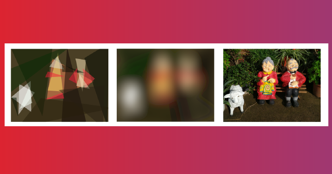
Shape
Sqip-loader split a given picture in arbitrary number of primitive shapes as as triangles, rectangles, ellipses, circles, polygons and others.
For shape-based placeholder in Webpack configuration the loader rule may look like:
{
              loader: "sqip-loader",
              options: {
                numberOfPrimitives: 20,
                mode: 1,
                blur: 0
              }
            }
Here we require 20 triangle-based shapes and no blur. That makes image imports available in the code as follows:
import { src, preview } from './image.png';
Where preview is generated SVGO Data-URL and src the full-quality image. So we have to modify src/component/Image.jsx. Instead of { placeholder.trace } we go with { placeholder.preview }.
Well, let’s run Webpack and check the page in the browser:

Blur up
This technique is often refereed as SQIP. While image load we see a blurred low quality placeholders similar to how it works on Medium. The placeholders can be also generated by Sqip-loader. However this time we are going to set blur:
{
              loader: "sqip-loader",
              options: {
                numberOfPrimitives: 20,
                mode: 1,
                blur: 30
              }
            }
The result looks so:

Recap
We we brushed up on src and srcset image attributes. We learnt how to use them together with their data-counterparts and Lazysizes library to take advantage of LQIP technique. We set up Webpack and a simple React.js example to fiddle with three SQIP approaches: silhouette, shapes and blurup.
The full code source of the example can be found here: