Mastering Responsive Web Design with HTML5
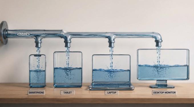
Bobby Solomon, from the Disney team, said in 2012: “Honestly, our team is bored of talking about responsive design. It’s how any self-respecting website should behave in 2012”. Responsive web design (RWD) is no panacea, but it is a clear quality indicator as the range of devices people use to browse the web keeps growing. Put simply, RWD is a way to deliver a decent user experience regardless of the device or screen size. The most common techniques are:
The fluid grid concept, which uses only relative units such as percentages, viewport units, em, ex, ch, and rem. This applies not only to font size but also to box dimensions and spacing properties (padding, margin, border, width, height, and so on).
Flexible images sized in relative units that scale proportionally to their container. For example, img { width: 100% } adjusts to the container width while preserving the image aspect ratio.
Media queries that let you tune styles based on the device’s screen characteristics.
Responsive Design + Server Side Components (RESS), which reduces bandwidth and speeds up loading by removing or replacing device-specific redundant assets (HTML, JavaScript, CSS, images).
From a design perspective, the right approach is to think about information architecture across the full range of target devices, starting from the most constrained and working up (progressive enhancement rather than graceful degradation). RWD patterns are a useful reference here.
Is that it? Not quite. The W3C has been working on native layout primitives that make many of these patterns cleaner to implement. Developers have long relied on hacks for RWD, but a number of the approaches below are now part of the standard and widely supported.
We use the Holy Grail Layout as a running example and show how it can be solved with different HTML5 approaches. The goal is to rearrange the page components depending on screen width, as shown in the illustrations below:


CSS Flexible Box Module
The Flexible Box Module provides an efficient way to arrange dynamically-sized elements within a container. Using CSS alone, you can define how items lay out, align, and distribute space depending on the viewport size.
Here is how the same example looks using the Flex Box module (using the modern syntax):
<div class="flex-container">
  <header id="header">Header</header>
  <article class="article">Article</article>
  <aside class="sidebar sidebar1">Sidebar</aside>
  <aside class="sidebar sidebar2">Sidebar</aside>
  <footer id="footer">Footer</footer>
</div>
.flex-container {
  display: flex;
  flex-flow: row wrap;
  text-align: center;
}

#header, #footer {
  background: rgb(173, 194, 226);
  width: 100%;
}
#header {
  order: 1;
}
#footer {
  order: 5;
}
.article {
  order: 3;
  flex: 1 60%;
  background: rgb(255, 255, 204);
}
.sidebar {
  flex: 1 20%;
}
.sidebar1 {
  order: 2;
  background: rgb(255, 204, 204);
}
.sidebar2 {
  order: 4;
  background: rgb(255, 153, 153);
}

/* iPads (landscape) ----------- */
@media only screen
and (min-device-width : 768px)
and (max-device-width : 1024px)
and (orientation : landscape) {
 .article {
    order: 2;
    flex: 1 100%;
  }
  .sidebar {
    order: 3;
    flex: 1 50%;
  }
  .sidebar2 {
    order: 4;
    flex: 1 50%;
  }
}

/* iPads (portrait) ----------- */
@media only screen
and (min-device-width : 768px)
and (max-device-width : 1024px)
and (orientation : portrait) {
  .sidebar {
    flex: 1 100%;
  }
}
We define a flex container .flex-container and its flex items (#header, #footer, .article, .sidebar). The container arranges items in a multiline row (flex-flow: row wrap). The order property controls render order independently of source order. The flex shorthand (flex: <grow> <shrink> <basis>) controls how items size relative to each other and their container.
That is just a starting point. The flex property gives you a lot of control over proportions and spacing. Properties like justify-content, align-items, and align-content handle alignment and distribution along both axes.
Browser support: Flexbox is now universally supported across all modern browsers without vendor prefixes.
Further reading:
- http://css-tricks.com/snippets/css/a-guide-to-flexbox/
- https://developer.mozilla.org/en-US/docs/Web/Guide/CSS/Flexible_boxes
- http://www.w3.org/TR/css3-flexbox/
CSS Grid Layout Module
The Grid Layout Module introduces a two-dimensional grid-based layout system. You define rows and columns in CSS and assign children to specific grid slots. Media queries can then change the grid structure for different screen sizes.
<div class="grid">
  <header id="header">Header</header>
  <article class="article">Article</article>
  <aside class="sidebar sidebar1">Sidebar</aside>
  <aside class="sidebar sidebar2">Sidebar</aside>
  <footer id="footer">Footer</footer>
</div>
html, body {
  height: 100%;
}
.grid {
  display: -ms-grid;
  -ms-grid-columns: 20% 1fr 20%;
  -ms-grid-rows: auto 5px auto 5px auto;
  text-align: center;
  height: 100%;
}

#header, #footer {
  background: rgb(173, 194, 226);
  -ms-grid-column-span: 3;
}
#header {
  -ms-grid-row: 1;
}
#footer {
  -ms-grid-row: 5;
}

.article {
  -ms-grid-row: 3;
  -ms-grid-column: 2;
  background: rgb(255, 255, 204);
}
.sidebar {
  -ms-grid-row: 3;
}
.sidebar1 {
  -ms-grid-column: 1;
  background: rgb(255, 204, 204);
}
.sidebar2 {
  -ms-grid-column: 3;
  background: rgb(255, 153, 153);
}


/* iPads (landscape) ----------- */
@media only screen
and (min-device-width : 768px)
and (max-device-width : 1024px)
and (orientation : landscape) {
  .grid {
    -ms-grid-columns: 50% 50%;
    -ms-grid-rows: auto 5px auto 5px auto 5px auto;
  }
  .article {
    -ms-grid-column: 1;
    -ms-grid-column-span: 2;
  }
  #header, #footer {
    -ms-grid-column-span: 2;
  }
  .sidebar {
    -ms-grid-row: 5;
  }
  .sidebar1 {
    -ms-grid-column: 1;
  }
  .sidebar2 {
    -ms-grid-column: 2;
  }
  #footer {
    -ms-grid-row: 7;
  }
}

/* iPads (portrait) ----------- */
@media only screen
and (min-device-width : 768px)
and (max-device-width : 1024px)
and (orientation : portrait) {
  .grid {
    -ms-grid-columns: 100%;
    -ms-grid-rows: auto 5px auto 5px auto 5px auto 5px auto;
  }
  .grid > * {
    -ms-grid-column: 1;
  }
  .sidebar2 {
    -ms-grid-row: 7;
  }
  #footer {
    -ms-grid-row: 9;
  }
}
Note: The code above uses the old -ms-grid syntax that IE10/11 implemented. The standardized display: grid syntax (with grid-template-columns, grid-template-rows, and grid-area) is now universally supported across all modern browsers without any prefixes. The -ms- prefix is only relevant for legacy IE support.
Further reading:
CSS Regions Module
Historical note: The CSS Regions spec was effectively abandoned. Chrome removed its implementation in 2014, and Firefox never shipped it. The examples below are kept for reference, but this approach is not viable for production use.
The Regions Module provided a content flow mechanism for specifying how content flows from one region to another. You could declare that, for a specific display size, certain content elements flow into defined layout regions.
  <div id="view">
    <header id="header">Header</header>
    <aside class="sidebar region1"></aside>
    <article class="article">Article</article>
    <aside class="sidebar region2"></aside>
    <aside class="sidebar region3"></aside>
    <footer id="footer">Footer</footer>
  </div>
  <div id="sidebar-sources">
    <aside class="sidebar1">Sidebar</aside>
    <aside class="sidebar2">Sidebar</aside>
  </div>
#view > * {
  display: inline-block;
  float: left;
  text-align: center;
}
#header, #footer {
  background: rgb(173, 194, 226);
  width: 100%;
}

.article {
  background: rgb(255, 255, 204);
  width: 60%;
}

#view > .region1,
#view > .region2 {
  background: rgb(255, 204, 204);
  width: 20%;
}
#view > .region1 {
  -webkit-flow-from: region1;
      -ms-flow-from: region1;
}
#view > .region2 {
  -webkit-flow-from: region2;
      -ms-flow-from: region2;
}
#view > .region3 {
  -webkit-flow-from: region3;
      -ms-flow-from: region3;
  background: rgb(255, 153, 153);
  width: 20%;
}

#view > .region2 {
  display: none;
}
#sidebar-sources {
  text-align: center;
}
#sidebar-sources .sidebar1 {
  -webkit-flow-into: region1;
      -ms-flow-into: region1;
}
#sidebar-sources .sidebar2 {
  -webkit-flow-into: region3;
      -ms-flow-into: region3;
}

/* iPads (landscape) ----------- */
@media only screen
and (min-device-width : 768px)
and (max-device-width : 1024px)
and (orientation : landscape) {
  #view > .article {
    width: 100%;
  }
  #view > .region3 {
    width: 50%;
  }
  #view > .region2 {
    display: inline-block;
    width: 50%;
  }
  #view > .region1 {
    display: none;
  }
  #sidebar-sources .sidebar1 {
    -webkit-flow-into: region2;
        -ms-flow-into: region2;
  }
}

/* iPads (portrait) ----------- */
@media only screen
and (min-device-width : 768px)
and (max-device-width : 1024px)
and (orientation : portrait) {
  #view > .region3 {
    width: 100%;
  }
  #view > .region2 {
    width: 100%;
  }
}
The idea was to define regions using flow-from and flow-into, separating data from layout. Content from a non-semantic source block (#sidebar-sources) would flow into named layout slots. The separation of data from view was the main selling point.
Further reading:
CSS Multi-column Layout Module
The Multi-column Layout Module is a simple way to flow text across multiple columns. It is not suited for the Holy Grail Layout, but it is useful for article-style content. The API is minimal:

<article class="article">
  <p>Lorem ipsum dolor sit amet, consectetur adipiscing elit. Proin eu lorem malesuada, feugiat lorem ut, placerat purus. Curabitur sem risus, suscipit ultrices suscipit in, elementum sit amet lorem. Cras volutpat rhoncus nibh, mollis pharetra ipsum semper eget. Vestibulum ante ipsum primis in faucibus orci luctus et ultrices posuere cubilia Curae; Proin eu odio neque. Nullam ut metus commodo est porta vulputate at quis arcu. Donec sed facilisis dolor. Sed viverra blandit sagittis. Suspendisse ullamcorper sem a placerat tincidunt.</p>
  <p>Pellentesque a auctor massa. Donec in convallis neque. Praesent in eros ut purus semper commodo in pharetra purus. Nulla facilisi. Cras accumsan ipsum ac pharetra faucibus. Quisque commodo felis eu mattis vehicula. Nam tincidunt hendrerit risus in ornare. Mauris eu nisl fringilla, pretium mi in, aliquet lacus. </p>
</article>
.article {
  -webkit-column-count: 4;
     -moz-column-count: 4;
          column-count: 4;
  -webkit-column-gap: 2em;
     -moz-column-gap: 2em;
          column-gap: 2em;
}

/* iPads (landscape) ----------- */
@media only screen
and (min-device-width : 768px)
and (max-device-width : 1024px)
and (orientation : landscape) {
  .article {
    -webkit-column-count: 3;
       -moz-column-count: 3;
            column-count: 3;
  }
}
/* iPads (portrait) ----------- */
@media only screen
and (min-device-width : 768px)
and (max-device-width : 1024px)
and (orientation : portrait) {
  .article {
    -webkit-column-count: 2;
       -moz-column-count: 2;
            column-count: 2;
  }
}
Browser support: Multi-column layout is now widely supported. The -webkit- and -moz- prefixes shown above are no longer needed in modern browsers.
Further reading:
CSS Template Layout Module
Historical note: The CSS Template Layout Module was never implemented by any major browser and the spec was abandoned. It is documented here for completeness.
The Template Layout Module aimed to abstract the layout grid at a higher level than Grid Layout. Like Grid Layout, the developer would describe the layout structure and assign components to named slots in CSS.
Further reading:
Position sticky
Making an element stick on scroll is a common pattern (Google News sidebar, fixed nav bars, and so on). Historically this required a scroll event handler, and having many sticky elements meant many handlers firing on every scroll action. The native position: sticky eliminates that entirely:
.is-sticky {
  position: sticky;
  top: 5px;
}
Browser support: position: sticky is now supported in all modern browsers without vendor prefixes. The -webkit-, -moz-, -ms-, and -o- variants shown in older code are no longer needed.
Further reading:
Fast loading
Bruce Lawson at FOWA 2013 in London advocated for WebP as a way to cut image file size by up to 26% compared to PNG with no noticeable quality loss. At the time it was only supported in WebKit browsers. The recommended fallback for background images was:
background-image: url("wavy.gif");
background-image: image("wavy.webp", "wavy.png", "wavy.gif");
And for content images:
<picture>
  <source src="foo.webp" type="image/webp">
  <source src="foo.png" type="image/png">
  <img src="foo.png" alt="insert alt text here">
</picture>
Browser support: WebP is now supported across all modern browsers. The <picture> element with <source> is the standard way to serve different image formats today.
He also presented the lazyload and postponed attributes (https://dvcs.w3.org/hg/webperf/raw-file/tip/specs/ResourcePriorities/Overview.html). lazyload marks a resource as non-priority. postponed does the same but only for invisible elements.
Conditional image loading with srcset was also on the horizon at the time:
<img alt="Example"
     src="banner.jpeg"
     srcset="banner-HD.jpeg 2x, banner-phone.jpeg 640w, banner-phone-HD.jpeg 640w 2x">
This lets you specify which image to load for mobile devices or high-density displays. srcset is now part of the HTML standard and is universally supported.
Further reading:
- http://www.html5rocks.com/en/mobile/high-dpi/#toc-srcset
- http://www.w3.org/html/wg/drafts/srcset/w3c-srcset/
Conclusion
Most of the features covered here were experimental or partially supported at the time of writing (2013). That has changed significantly. Flexbox, CSS Grid, multi-column layout, position: sticky, WebP, and srcset are all now part of the baseline and work without polyfills or vendor prefixes in every modern browser.
CSS Regions and the CSS Template Layout Module did not make it through. Regions were removed from browsers before they gained traction, and Template Layout was never implemented.
For everything else, the recommendation stands: follow the W3C specs, use the standard properties, and reach for polyfills only when legacy support genuinely requires it.