Items in category rwd

Enhancing UX with LQIP: How to Build an Awesome Image Preview

RWD
Enhancing UX with LQIP: How to Build an Awesome Image Preview

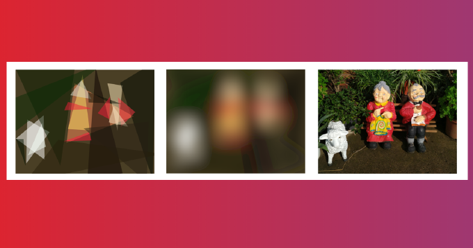
Images in HTML, what could be easier? However when you have many of them on a page, they do not appear immediately. That depends on caching strategy and bandwidth, but still if you don’t take a special care it may look quite ugly. Basically we need to fill in the slots with something appropriate while images are loading. In other words we need placeholders. Probably the most prominent technique here is LQIP (low quality image placeholder). It was adopted by Google, Facebook, Pinterest, Medium and others. The idea is to load page initially with low quality images and once the page is fully loaded replace them with full quality ones. As placeholder one can use embedded transparent SVG, spinner animated image, solid color, blurred and minified original image. But even more, with modern tools we can do something really fancy. For example, we can use images shape or silhouette as a placeholder. Moreover, we can generate Data-URLs with desired effect during the build and address from IMG tag.


Responsive Web Design: Best Practices for Improving Performance

RWD
Responsive Web Design: Best Practices for Improving Performance
Image generated by Gemini

User are impatient. Majority would leave a resource if it failed delivering the core user experience in 1-3 seconds. Today when mobile overtakes fixed Internet access you need to think of how the app loads on a low bandwidth, what images must requested on what devices, how stylesheets and JavaScript are cached e.t.c. Fortunately there a number of amazing tools such as PageSpeed Insights, WEBPAGETEST, Pingdom Website Speed Test. So you can find out whats wrong with your app in terms of web-performance. Chore DevTools emulator gives an idea how you app renders with different connection speeds. As you see there are many ways to discover if you have performance issues and what they are. But that brings to the question “how to solve them?”. Here I am to share my experience.

Mastering Responsive Web Design with HTML5

RWD
Mastering Responsive Web Design with HTML5
Image generated by ChatGPT

As the variety of screen sizes and devices keeps expanding, Responsive Web Design (RWD) has become a baseline expectation rather than a nice-to-have. When the first HTML and CSS specs were written, RWD was not a concern. Since then, a lot of work has gone into providing native ways to achieve it.

This article presents hands-on examples of common RWD tasks implemented with W3C modules: CSS Flexible Box, CSS Grid Layout, CSS Regions, CSS Multi-column Layout. It also covers position sticky, the srcset attribute, and WebP fallbacks.