Contents
I started this blog more than two decades ago. It has been through a few redesigns since then, and none of them really satisfied me. I’m not a designer. I can tell when a page looks off, but I rarely know why, and I know even less about how to fix it. So the site always looked like a developer had styled it, which is exactly what happened.
This time I gave the job to Claude Code, with skills. A skill is a folder with a SKILL.md file (instructions, sometimes scripts and reference docs) that Claude loads only when the task matches what the skill describes. Anthropic publishes official ones, and the community has written many more by now. I asked Claude which of them are worth having for front-end work, and one name stood out: frontend-design from Anthropic.
The first run was that skill and a one-line prompt. The result wasn’t bad, but it wasn’t something I’d ship. So I ran it again, this time with my design preferences written out. That was better. But both runs did the same thing. They read the code, picked a direction and started building. Nobody asked me what I actually wanted, or argued when what I asked for didn’t make sense.
What if one skill asks the questions, another argues with my answers, a third judges the result and a fourth checks it in a browser? For the third run I chained five skills, each with one job: Superpowers for brainstorming, grilling to challenge the direction, taste-skill to judge it, frontend-design to build and webapp-testing to check the pages in a real browser. It took 147 model calls, against about 50 for the first run. And it was the first redesign of this blog I was happy enough with to put live. You’re looking at it.
For each run I show the prompt, what Claude came back with and what it cost in tokens, then a quick comparison with the run before. The recap at the end puts all three side by side.
The old design#
This is how the home page and an article looked before:


The site worked. I just felt the overall design didn’t look as professional as I wanted it to. What exactly was wrong with it? I couldn’t tell. I wanted a blog that looks like someone designed it on purpose, and that stayed the goal in all three runs.
When you go through the runs below, keep an eye on the white post cards, the copper label chips and the widget sidebar on the right. Claude went after those every time.
Run 1: one skill, one line#
frontend-design lives in Anthropic’s skills repository. The skills CLI installs it for Claude Code:
npx skills add https://github.com/anthropics/skills --skill frontend-design -a claude-code
I kept the prompt as short as I could while still telling Claude where things are:
/frontend-design Redesign the look and feel of my blog. It's a Hugo site, templates are in layouts/ and styles in assets/scss/.
This is what Claude came back with:


Claude's report after run 1
I’ve redesigned the blog and checked it in screenshots at 1440px and 390px, in light and dark mode: home, article, category, Books, About and 404. hugo -D builds with no errors or warnings. Nothing is committed.
The live site was still using the old compiled assets/css/index.css. The SCSS added in the last commit (“Time in the margin”) was never connected to the templates. I replaced that SCSS and pointed the templates at it, so styles now compile from assets/scss/main.scss.
The idea. Your About page says you started out building a pseudo-graphics GUI for Clarion in C and Assembler. So code blocks now look like old text-mode editor windows: a deep blue background, a double line across the top, the language name set into that line like a window title, and [ Copy ] at the right. That’s the one bold element. The rest is a white page with one blue for links, code and the footer. Amber appears only on blue surfaces and in text selection.
- Type: Atkinson Hyperlegible Next for text and headings, Atkinson Hyperlegible Mono for code. It’s built to keep look-alike characters like l 1 I and 0 O apart, which suits a site with this much code. The zero has a slash, so dates show it too.
- Home: the newest post is first, set large with its description and cover. Older posts are plain rows with title, category, date and description. The white cards with share toggles are gone.
- Article: large title, cover, text kept to about 68 characters per line. Code and images can run wider than the text. On wide screens the table of contents stays fixed on the right and highlights the section you’re reading. On phones it’s a collapsed box above the text.
- Right column (labels, GitHub, gists, codepens): all kept, set small in dark text so it doesn’t compete with the post.
- Dark mode follows the reader’s system setting.
Brand changes#
- I kept the {D:S} mark but set it in the mono font with blue braces.
- I dropped the copper. #D48166 on white is 2.9:1 contrast, which is too low for link text. Copper on a light page is also the most common look on generated sites right now.
- The navigation is sentence case now, not uppercase Oswald, so it fits on a phone without the menu button.
Other changes#
- In
config.tomlI setmarkup.highlight.noClasses = false, so the code colours come from my SCSS. The old github-dark inline colours no longer apply. - I added three bits of text: a “Books” heading on the Books page, a “Share” label next to the share icons, and “N posts” under the title on category and tag pages. The /categories/ and /tags/ pages used to show “Taxonomy terms” as placeholder text. They now list every term with its post count.
- I left
assets/css/index.cssandassets/css/syntax.cssin place. Nothing uses them now, so you can delete them.
So what did I get? Next to the old design, it’s a clear step up. Without the boxes and chips the page looks cleaner and more professional, the body text is easier to read and the headline is the first thing you see. Still, I’d scroll past it without a second look. The rest is black text on white, a thin blue accent and a sidebar of plain links, which could belong to anyone’s blog. The charcoal header and the copper went too, and they were most of what made the site look like mine. Claude probably had a reason for dropping the copper (2.9:1 contrast on white really is too low for links), but it didn’t ask before throwing out the brand colour.
The run took about 50 model calls and 6M tokens. That sounds like a lot until you look at what the tokens are. About 97% of them are cache reads: on every call the agent re-reads the whole conversation, and screenshots make that conversation bigger with each step. Fresh work (output plus cache writes) came to about 202K tokens.
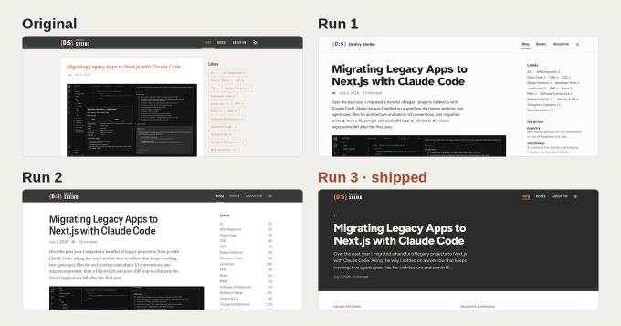
Original vs run 1#
| Original | Run 1 | |
|---|---|---|
| Header | Charcoal, copper {D:S}, all-caps Oswald menu | White, monospace {D:S}, sentence-case menu |
| Accent | Copper | Blue |
| Post on home | White card on a grey page, copper title | No card, large black headline |
| Labels | Bordered copper chips | Plain text links |
| Article | White card, grey body text | No card, near-black text, bigger headline |
| Overall | Recognisably mine, but dated | Cleaner and more professional, but could be anyone’s |
Run 2: same skill, a real brief#
This time I wrote down what I actually wanted: how the pages should feel, what to keep from the old brand, what not to touch and which pages to cover.
/frontend-design

Redesign the look and feel of my blog, dsheiko.com. It's a Hugo site:
templates in layouts/, styles in assets/scss/. Content stays as is.

I'm fine with the current design, but I'd switch if the new one is
clearly better. I don't have a style in mind. Follow what works for
developer blogs.

What matters to me:
- It should feel good: balanced colors, comfortable font sizes, a clear
  type scale.
- Content first. The latest article should be visible on the first
  screen, not pushed down by a hero or decorative blocks.
- One clear focal point per page. Nothing should compete with the
  article.
- Keep the {D:S} logo and the brand feel (copper accent, dark header)
  unless you have a strong reason to change it, and tell me the reason.
- Don't invent copy. No new taglines, intros or headings that aren't
  already in the content.
- Works at phone width.

Pages to cover: home, article page, category/tag listing, about, books.
And the result of run 2:


Claude's report after run 2
The redesign is done for all five page types: home, article, category/tag listing, About and Books. The 404 page and footer got the same treatment. I checked every page at 1440px and 390px in screenshots, and hugo -D builds without errors. Nothing is committed.
What changed#
- Home: the newest post is the one focal point. Its title, date, description and cover are all on the first screen, and the next post’s title shows above the fold on a 1440×900 screen. Older posts are plain text rows (title, date, category, description). The old cards with big screenshot thumbnails are gone.
- Article: no white card around it. Big headline, meta line, then the cover. Prose is set at about 70 characters per line, and code blocks and images use the full column width. The table of contents sits in a sticky right column on wide screens and highlights the section you’re reading. On phones it becomes a collapsed “Contents” box.
- Right column (Labels, GitHub, gists, codepens, Contacts, Reading shelf): all kept, but small and muted so it doesn’t compete with the article. On phones it moves below the content.
- Type: Instrument Sans for headings and UI, Source Serif 4 for body text, IBM Plex Mono for code only. Sizes come from one scale: 14/16/18/21/24/36/48px.
- Colours: white page, charcoal text. The header, footer and code blocks share the brand charcoal, so code reads as part of the brand. Code keeps the GitHub-dark syntax colours, with a copper left edge on each block.
- Dark mode follows the visitor’s system setting. It’s an addition you didn’t ask for, and easy to remove if you don’t want it.
Brand changes, and why#
- Logo: {D:S} and the Oswald name are unchanged.
- Links on white use a deeper copper, #A14E31. Your #D48166 on white is 2.9:1 contrast, which fails accessibility guidelines for text. It’s 5.75:1 for the deeper shade. #D48166 is still used on dark surfaces: logo braces, the active-nav bar, the code edge, the cookie button.
- Navigation is sentence case instead of Oswald capitals. It fits on a phone without the burger menu, so the burger is gone.
- Removed (chrome, not content): the share widget and “comments” link on every card in the list. Share links and comments are still on each article.
Copy: no new text. The only wording changes: list descriptions are cut at about 240 characters, and the tag page heading is the tag name (#Next.js). It had no heading before.
Things to know#
- I replaced the files in
assets/scss/. They were a cobalt/yellow attempt that nothing loaded. The site now compilesscss/main.scss. The oldassets/css/index.cssand_design/are unused but still on disk, so delete them when you’re happy with this. assets/js/site.js(contents scroll-highlight, copy button on code blocks, back-to-top) was also unused. It’s loaded now.content/_index.mdhasdraft = true, so the home page only exists when you build with-D. Your npm scripts already pass-D, but plainhugo servershows a 404 on the home page.- The puppetry image in the GitHub list showed as broken in my test browser. That looked like a network limit in my sandbox, not the page, but check it on the live site.
I think run 2 is run 1 again, only more refined. The layout barely moved: no cards, a big headline, Contents on the right. But the charcoal header and the copper are back, so it looks like my site again, and the body text is now serif. Claude didn’t throw the copper out this time. It kept it for dark surfaces and picked a darker shade for links on white, which fixes the contrast problem and keeps the brand.
This one took 60 model calls and about 7.6M tokens. Fresh work came to about 230K, only a bit more than run 1. The other 7.4M is cache reads again.
Run 1 vs run 2#
| Run 1 | Run 2 | |
|---|---|---|
| Header | White, monospace {D:S} | Charcoal again, copper {D:S} and the Oswald name back |
| Accent | Blue | Copper, a deeper shade for links on white |
| Body text | Sans | Serif |
| Labels | Plain links, wrapped in rows | One per line, counts aligned on the right |
| Article | No card, date and category above the headline | Same layout, date and category moved below the headline |
| Overall | Cleaner, but could be anyone’s | Just as clean, and it looks like my site again |
Run 3: five skills in a chain#
Run 3 needs four more skills. Superpowers, Matt Pocock’s skills (grilling comes from there) and taste-skill are distributed as Claude Code plugins, so they install from inside a session. I started claude in the project directory and ran:
/plugin install superpowers@claude-plugins-official
/plugin marketplace add mattpocock/skills
/plugin install mattpocock-skills@mattpocock
/plugin marketplace add Leonxlnx/taste-skill
/plugin install taste-skill@taste-skill
webapp-testing comes from Anthropic’s repository, same as frontend-design, so it goes through the skills CLI in a regular terminal. The -g flag installs it globally, so every project gets it:
npx skills add anthropics/skills --skill webapp-testing -g -a claude-code
For run 3 I kept the same brief and added two rules. Claude wasn’t allowed to write any code until I approved a written design spec, and the work was split between five skills, each with one job:
# Redesign dsheiko.com, design first

Redesign the look and feel of my blog, dsheiko.com. It's a Hugo site:
templates in layouts/, styles in assets/scss/. Content stays as is.

I'm fine with the current design, but I'd switch if the new one is
clearly better. I don't have a style in mind. Follow what works for
developer blogs.

What matters to me:
- It should feel good: balanced colors, comfortable font sizes, a clear
  type scale.
- Content first. The latest article should be visible on the first
  screen, not pushed down by a hero or decorative blocks.
- One clear focal point per page. Nothing should compete with the
  article.
- Keep the {D:S} logo and the brand feel (copper accent, dark header)
  unless you have a strong reason to change it, and tell me the reason.
- Don't invent copy. No new taglines, intros or headings that aren't
  already in the content.
- Works at phone width.

Pages to cover: home, article page, category/tag listing, about, books.

Don't write code until I approve a written design spec.

Run this as a chain of skills, each with one job:

1. superpowers:brainstorming: explore. Read the site first (templates,
   SCSS, a few real articles) without changing files. Interview me one
   question at a time. Propose 2-3 directions that are really different,
   not variations of one template. Use the visual companion for mockups
   when seeing beats reading.
2. grilling: challenge. Once a direction is on the table, grill me on it.
   Readability, hierarchy, contradictions, things I haven't decided.
   Disagree when you think I'm wrong.
3. taste-skill: judge. Review the directions, then the final spec. Say
   which direction has the strongest identity and what's generic about
   the others.
4. frontend-design: build the approved spec inside the existing Hugo
   templates and SCSS pipeline. No new frameworks or dependencies.
5. webapp-testing: check it in a real browser. Home, article, tag
   listing, about, books at 1440, 768 and 390 px. Keyboard navigation,
   focus states, console errors, broken links and assets, hugo build.
6. taste-skill + frontend-design: final pass on the rendered pages.
   Fix what looks off, then run step 5 again.

The spec covers: concept, type scale, palette with contrast ratios,
spacing, page patterns, responsive rules.

Rules:
- Keep content, URLs and SEO metadata.
- Don't skip a skill. If one has nothing to add, say so.
- After I approve the spec, go straight to step 4. Skip the
  writing-plans handoff.

When done, write docs/redesign-log.md: for each skill, what it did and
one decision it changed or confirmed.
Most of run 3 was me answering questions. I kept the whole conversation below, split by skill. Each block is folded, so open the ones you’re curious about.
Step 1, brainstorming: the interview and three directions
Claude: First question: the last time you read one of your own posts on the live site, what was the first thing that felt off, if anything?
Me: I realized that the overall visual design probably didn’t look as professional as I wanted it to.
Claude: “Not professional” can mean a few things. My guess is that it’s the parts that date the site: white boxed cards on a grey page, bordered copper chips, all-caps condensed nav, and a sidebar full of widgets. Together those read like a 2015 blog theme, not like the work of someone with 27 years in the field. Correct me if it’s something else.
Is there a developer blog or site you’ve read recently that felt professional to you, and what about it gave you that impression?
Me: I like the overall look and feel of Medium publications, as well as sites like Smashing Magazine, Cloudflare Blog, Martin Fowler and DEV Community.
What I appreciate about them is their clean, professional presentation, strong typography, clear content hierarchy and focus on readability. They make technical content feel approachable without being visually boring or overly decorative.
I particularly like the editorial feel of Medium, the polished presentation of Cloudflare’s blog and the technical depth and straightforward structure of Martin Fowler’s site.
Claude: Why the redesign: The site works, but it doesn’t look as professional as you’d like. “Professional” for you is the feel of Medium, Smashing, Cloudflare’s blog, Martin Fowler and DEV: clean presentation, strong typography, clear hierarchy, readability first. Technical content should feel approachable, and the site shouldn’t turn plain or decorative to get there.
What those sites have in common (my reading, not something you said):
- On article pages there’s no sidebar, or one so quiet you stop noticing it. Medium, Cloudflare and Fowler all run a single centred column of about 680–740px.
- Body text is near-black at 18–21px. None of them use grey body copy.
- Chrome is minimal. Hairline rules replace boxes and borders, and the article title is the biggest thing on the page.
- Listing pages split into two camps. Cloudflare and DEV use image-led cards. Fowler and Medium use text-led lists where the title and summary do the work.
Three different pulls (also my reading). Medium is editorial, with a serif body and lots of air. Cloudflare is polished product-blog: a sans-serif, crisp and image-heavy. Fowler is a working document: dense, structured, text-first. I think these are the raw material for genuinely different directions, not one template with tweaks.
What this implies for your site (my guess): the white cards, the bordered chips and the widget sidebar are what work against “professional”. Copper and the dark header aren’t the problem.
What’s wrong or missing in that?
Me: I totally agree with your assessment.
Claude: Good, so the boxes, chips and widgets are what we’re fixing. Copper and the dark header stay.
When someone finishes one of your articles, what would you like them to do next?
Me: I’d like them to continue reading by going to a related article in the same series or on a closely related topic. Ideally, the site should make the next relevant article obvious and encourage readers to explore more of the content rather than just reaching the end of the page and leaving.
Claude: Got it. One thing I checked: no post carries series metadata. Four old Drupal/realtime posts link to related articles by hand in their body text, and that’s all. So “the next relevant article” would come from Hugo’s built-in related-content feature, matching on tags and categories. It’s a template change only, with no content edits and no new dependency.
How do you feel about the cover images on your posts: are they part of what makes a post yours, or decoration you could live without on the listing pages?
Me: I’m a bit undecided about this. Personally, I find cover images useful because they attract attention and give readers a visual impression of an article before they start reading. However, I’m not a designer or artist, so most of my current cover images are AI-generated. I’m concerned that this might actually put some readers off or make the blog look less professional.
Claude: This might be easier if I show you. Want me to open a browser tab with some mockups?
Me: Sure!
Claude: The mockup screen is up (a local browser tab). It shows your four latest posts, with real titles, descriptions and covers, in three treatments. Only the image handling changes between them:
- A. Image-led: a big cover on the latest post, then an image grid. This is how Cloudflare and DEV do it.
- B. Thumbnail: text leads and the cover is a small picture on the right. This is the Medium approach.
- C. Text only: no images on listing pages, like Martin Fowler’s site. Covers appear only on the article page and in social previews.
One data point: 56 of your 93 covers are credited to an AI generator (DALL·E, Gemini, ChatGPT or Grok). Another 19 have an empty credit field.
Take a look, and click one if it helps. Which of these treatments feels closest to how you want the blog to come across?
Me: I’ll go with C. Text only. I’m concerned that the AI-generated cover images might put some readers off rather than attract them. I’d prefer a clean, typography-driven presentation where the article titles and descriptions do the work of attracting attention.
Claude: The three directions are on the same tab, so just refresh it. Each one shows the home page and an article, using your real posts. All three keep {D:S}, the charcoal header, copper, text-only listings, and no sidebar on article pages.
- Editorial (Medium, Smashing). Serif body at about 20px, one centred column on every page, lots of white space. The header is a slim band, and copper shows up only on category links and the active nav item. It’s the calmest and most bookish of the three.
- Index (Martin Fowler). Sans body at 18px, with monospace for dates, categories and nav, which picks up the code-brace look of {D:S}. Home is a dense dated index. Articles get a sticky “Contents” rail on the left, which pays off on your long posts (one has 22 sections). It fits the most information on a screen and has the least decoration.
- Masthead (Cloudflare blog). The charcoal header grows into a band that carries the newest post on home and the title on article pages, with a copper category label above it. Everything below is a crisp white page in a modern sans. The rest of the home page is a two-column grid of text tiles. It has the strongest brand presence.
I’m not ranking them yet. Judging the directions is the taste step, and I’ll do that once you’ve reacted.
Which one feels most like your blog, and is there anything you’d pull across from the others?
Me: I choose 3. Masthead
The mockups came from the brainstorming skill’s visual companion. Superpowers starts a small local web server and opens a page in the browser that stays connected to the session (that’s the “Connected” in the corner). Claude puts mockups built from my real posts on that page. I look at them in the browser and answer in the chat. These are the three directions it showed me, home on the left and article on the right:

Step 2, grilling: sixteen decisions in two rounds
Claude: Grilling round 1. These are the decisions I can put to you now. Each one has my recommendation, and “yes” accepts it. Where I think you’re wrong, I’ve said so.
❓ Q1 - Masthead on the home page vs. “no hero”: You asked that nothing push the latest article down. A dark band holding the newest post is fine on desktop, because the article itself is the content there. At 390px, though, a band with title, description and meta fills most of the first screen, so the second post drops below the fold. I’d accept that, but only if the band stays tight. On home it gets the category, the title, the description clamped to 3 lines and the meta, with no extra padding. Pages 2+ of the pagination get a slim header with no masthead.
➡️ Yes: tight masthead on page 1 only, description clamped to 3 lines. At 1440px the first row of tiles must be visible without scrolling.
❓ Q2 - “Don’t invent copy” vs. a related-articles block: You want readers to see the next relevant article. That block needs a label, and that runs into your no-new-headings rule. The way out: the phrase “Related articles” already appears in the content of four of your posts. I’d reuse it, and not write anything like “You might also like”.
➡️ Yes: label the block “Related articles”. It shows 3 posts picked by Hugo’s built-in related-content feature (matching tags and categories), placed after the article body and before Previous/Next and comments.
❓ Q3 - Where the sidebar content goes: Removing sidebars shouldn’t delete anything. Here’s what lives in them today and where I’d put it:
- Labels (category chips, on home, listings and 404): a plain list in the footer, not chips.
- Contents (TOC on articles): see Q4.
- My github / My gists / CodePen (home, listings, Books): moved to the bottom of About.
- Contacts + My Reading Shelf (About): they stay on About, as a second column on desktop and below the CV on mobile.
➡️ Yes to all four moves.
❓ Q4 - Contents on long articles: Cloudflare has no TOC. Your posts run to 22 sections, though, and the current site shows “Contents” in the sidebar. I’d keep it in two forms. At widths of 1200px and up, it’s a sticky list in the left margin beside the body: small grey text that stays quiet. Below 1200px, it’s a collapsed “Contents” disclosure above the first paragraph. Either way it only appears when the post has headings, which is the current rule.
➡️ Yes: margin TOC on wide screens, collapsed disclosure on narrow ones.
❓ Q5 - Copper contrast (a brand change, here’s the reason): Your copper #D48166 reaches only 2.9:1 on white and 3.9:1 on charcoal. That fails WCAG AA for normal-size text in both places, so it can’t stay as the link and label colour. I’d split it into three tones that read as one family:
- Logo stays #D48166. A logo is exempt from contrast rules.
- Bright copper on charcoal for the masthead kicker and the active nav item, lightened until it reaches at least 4.5:1.
- Deep copper on white for links and tile kickers, darkened until it reaches at least 4.5:1, aiming for about 5.5.
➡️ Yes: three copper tones, with exact values and ratios in the spec.
❓ Q6 - Typefaces: The mockup used Figtree. My recommendation is Figtree for headings and body, IBM Plex Mono for code, and Oswald kept only for the {D:S} logo. Oswald + Open Sans + Lora go away, so the font payload drops. Fonts keep coming from Google Fonts the way they do now, so there’s no new dependency. Body text would be 18px with 1.7 line height, a measure of about 68 characters, and near-black on white.
➡️ Yes to Figtree + Plex Mono + Oswald for the logo only.
❓ Q7 - Cover image on the article page: Here I’m pushing back on the choice you made. You dropped covers from listings because AI art might put readers off. On the article page the cover is the first thing a reader sees after the title, so the same worry applies there, just one click later. Removing covers counts as a content change, which you ruled out. So I’d keep them, sized to the text column (not full width), and keep the “Image generated by…” credit as it is today.
➡️ Yes: keep covers at column width, with the credit.
❓ Q8 - Tile descriptions on home: Your descriptions run from one line to about 320 characters. In a two-column grid that makes the rows ragged. I’d clamp tile descriptions to 3 lines with CSS. The full text stays in the HTML for SEO, and nothing is rewritten.
➡️ Yes: 3-line clamp on tiles. One column below 700px.
❓ Q9 - Tag and category pages: Today, categories show Items in category <b>name</b> and tags show no heading at all. In the masthead style, the term name becomes the title. For the kicker I’d use the single words “Category” or “Tag” plus the post count. These are labels, not new copy, and “Items in category” goes away.
➡️ Yes: kicker “Category” or “Tag” plus the count, term name as the masthead title, then the same tile grid.
❓ Q10 - Out of scope: To keep this pass focused, I’d leave out dark mode (the site doesn’t have one today), search and comments, and the behaviour of the cookie bar. The cookie bar gets restyled to match and made more compact, but its logic in enhancement.js doesn’t change.
➡️ Yes: all four stay out of scope, apart from restyling the cookie bar.
Me: Yes, proceed with this recommendation.
Claude: All ten are settled. Round 2 covers the decisions those answers opened up.
❓ Q11 - Footer: The footer keeps all its current content: “Who’s the dude?” with your photo and line, “Elsewhere”, “Credits” and the copyright row. Per Q3 it also gains the Labels list. I’d make it the same charcoal as the masthead so the page has a dark band at the top and the bottom. Small 15px text, deep layout grid on desktop, stacked on mobile.
➡️ Yes: charcoal footer, same content plus Labels.
❓ Q12 - About and Books get the slim header, not a masthead: The masthead works where a page has a natural title: an article, the newest post, a category. About already opens with “Dmitry Sheiko / Senior Full-Stack Web Developer” inside the content. Books has no title at all, and its focal point is the three real book covers, which aren’t AI art. A masthead there would mean inventing a heading or repeating the first one. So those two pages get the slim charcoal header, and the content starts on white. On Books, each book is a row with the cover on the left and the text on the right, stacking on mobile.
➡️ Yes: slim header on About and Books, book rows on Books.
❓ Q13 - Code blocks: Code is all over your posts. I’d set code-block backgrounds to the masthead charcoal and keep your existing github-dark syntax colours from config.toml. Code would be 15px Plex Mono with horizontal scroll and no wrapping, and inline code gets a light warm grey chip. The dark blocks then rhyme with the masthead and don’t look like a foreign widget.
➡️ Yes.
❓ Q14 - Mobile nav: Today, phones get a burger menu (a checkbox hack) for just three links plus RSS. At 390px, “Blog Books About me” and the RSS icon fit on one line next to {D:S}. I’d drop the burger so every link is one tap away and visible.
➡️ Yes: no burger, inline nav at every width.
❓ Q15 - Order of the article footer: After the body I’d use this order: the share links (as today), then Related articles (3 posts), then Previous / Next, then comments (giscus). Related articles comes before Previous / Next because it’s the thing you said you want readers to take.
➡️ Yes to that order.
❓ Q16 - Repo cleanup: The new styles go in assets/scss/ and are compiled with Hugo toCSS, which replaces the unwired “Time in the margin” SCSS that’s in there now. header.html stops loading assets/css/index.css, and I’d delete that file. I’d also delete the orphan partials from that earlier attempt (article-lead, post-list, term-page, cover, icon, image-credit) if nothing references them after the build. The README’s styling paragraph gets corrected. _design/ stays untouched, because it still builds static/build/enhancement.js, which handles lazy-load, zoom and the cookie bar.
➡️ Yes: replace and delete as described, and leave _design/ alone.
Me: Yes, proceed with this recommendation.
Claude closed the grilling step only after I confirmed we were on the same page:

Step 3, taste-skill: judging the directions and the spec
Claude: I read taste-skill (design-taste-frontend 2.5.1). It’s built for company landing pages: a hero alone on the first screen, one section per screen, photographs, motion “moments”, shader effects, and copying its starter kit into the project. A lot of that directly contradicts your brief (content first, no hero, no invented copy, no new dependencies). It also says “deal, never choose by taste”, which would have its scripts override the direction you picked. I’m applying only the parts that work as review criteria: whether it looks made for this client or from a template, one consistent system, equal edges, contrast, focus and tap sizes, and the “no caption under images” rule. Its kit and scripts stay out of the repo.
Judging the three directions#
- Strongest identity: 2, Index. Monospace dates and categories echo the {D:S} braces. A dated index suits 93 posts spanning 2003–2026, and the contents rail fits how you actually write: long, sectioned posts. It reads as one specific engineer’s site.
- Strongest brand presence: 3, Masthead, your pick. The charcoal band is earned, because it turns your existing header into structure rather than adding decoration. But two parts are generic:
- The tiles. An uppercase letter-spaced kicker over a 3px top rule is the stock tech-blog tile. You see it on half the corporate engineering blogs out there.
- Figtree. It’s pleasant but it’s the 2024 default sans. Nothing about it says “you”.
- Most generic: 1, Editorial. A serif body in a centred column on warm white is what every Ghost or Medium-style theme ships. It’s calm, and nobody would remember it.
What the judge would change in Masthead#
- Monospace for meta. Kickers, dates and reading time go in IBM Plex Mono, which you’re already loading for code, set in sentence case rather than spaced-out capitals. That’s Index’s best trait at no extra cost.
- A headline face with more character. Schibsted Grotesk is a grotesk drawn for a newspaper group, which suits a masthead. It would cover headings and body, with Figtree dropped.
- Move the “Image generated by…” credit. Taste-skill says credits don’t sit under pictures. For you there’s a sharper reason: a line announcing “DALL·E” right under the title amplifies exactly the AI-art worry you raised. The text stays, word for word, in the article footer next to the share links.
- Equal edges. On article pages, the masthead title starts on the same left edge as the body column, not the page edge. On home, it starts on the tile grid’s edge.
Points 1 and 2 are visual, so I’ll put them side by side on the companion tab for you to compare.
The layout and colours are identical on both sides. Only the faces and the meta styling differ:
- Left (A): Figtree throughout, as mocked, with uppercase letter-spaced kickers.
- Right (B): the judge’s version. Schibsted Grotesk for headings and body. Kickers, dates and reading time are in Plex Mono, in sentence case. Dates switch to ISO format (2026-07-02), which suits monospace. That date format is a visible change, so it’s part of what you’re approving.
Both sides use a 1px tile rule instead of the 3px bar. The 3px bar was part of what read as stock, and I’d drop it whichever face you choose.
Do you take B, together with moving the image credit into the article footer and aligning the masthead to the column edges?
Me: I choose Left (A)
Claude: The taste pass on the spec found four things, all now fixed in the draft:
- Two button styles, shared by the cookie bar and the 404 page. Before, each had its own.
- Tap targets. Small links (kickers, tags, footer, TOC) get at least 24 by 24 px. Nav and buttons get 44 px.
- Heading outline. Home gets a visually hidden h1 using your existing site title, and Books gets a hidden “Books” h1. No heading level is skipped on any page.
- Button labels keep the sentence case they’re written in (“Go to the blog”), with no forced capitals.
The font question came through the same companion page. On the left is what I picked, Figtree with uppercase kickers. On the right is the version taste-skill pushed for, with Plex Mono for labels and dates and ISO-style dates:

Some decisions came as multiple-choice questions with a recommended option. This one is about the Related articles block, since 25 of my 93 posts have no related match by tags or categories:

The spec, ready for approval
Claude: The design spec is ready for your approval: docs/superpowers/specs/2026-11-13-masthead-redesign-design.md. It covers the concept, the type scale, the palette with contrast ratios, spacing, the pattern for each page, and the responsive rules. I haven’t committed it.
The Related articles block now always shows 3 posts, as you chose. These are the calls I made that you didn’t, so check them while reading:
- Taste changes, section 12 A–C:
- The “Image generated by…” credit moves from under the cover to the article footer, same wording.
- The masthead text lines up with the content edge below it.
- Tiles use a 1px top rule instead of a 3px bar.
- Copper: #D48166 stays on the logo only. Text uses #E3977A on charcoal (6.0:1) and #A14B2B on white (5.9:1). The header charcoal goes from #373A36 to #2B2C2A.
- Home page 1: the masthead post plus 11 tiles, so the pagination URLs stay the same. The last row has one tile.
- No duplicate “Related articles”: five older posts already have a hand-written “Related articles:” line, and they skip the automatic block.
/weblog/gets the same treatment as home._default/single.html(currently a stub) becomes the article template.- Heading outline: a visually hidden h1 on home (your existing site title) and on Books (“Books”).
- Buttons and tap targets: one shared pair of button styles for the cookie bar and the 404 page. Small links get at least 24px tap targets, nav and buttons 44px.
- Ported styles: before
index.cssis deleted, the styles your content andenhancement.jsdepend on are carried over with the same class names. - Fonts: Oswald 400 is added so the “DMITRY” line in the logo doesn’t change.
How taste-skill was used, for the log: it isn’t registered in this session, so I applied its SKILL.md as a review rubric only. Its kit, scripts and landing-page rules (hero screen, photos, motion “moments”, picking a design by script) don’t fit this brief, and I kept them out.
Do you approve the spec? Once you do, I’ll go straight to step 4 (build) and skip the writing-plans handoff, as you asked.
Me: I approve. Please proceed.
Steps 4 and 5, frontend-design and webapp-testing: Claude's final report
What changed#
- Look: a charcoal masthead carries the newest post on home, the title on articles, and the term on category and tag pages. Listings are text-only tiles, with no cover images. Type is Figtree, Plex Mono for code, and Oswald for the {D:S} logo only.
- Copper: it now passes AA. The logo keeps #D48166, and text uses a lighter copper on charcoal and a darker one on white.
- Sidebars are gone. Their content moved to the footer (Labels) and the bottom of About (GitHub, Gists, CodePens).
- Articles: they get a Contents rail on wide screens and a collapsible Contents on narrow ones. They end with “Related articles”, which always shows three posts.
- Styles now live in
assets/scss/and are compiled by Hugo toCSS. The oldindex.css, the unwired SCSS and 13 orphan partials are deleted. The README is corrected.
Testing#
- I checked 10 page types at 1440, 768 and 390: no horizontal overflow, focus is visible on every stop, the skip link works, and there’s one h1 per page with no skipped heading levels.
- On the first screen, the newest post and the first row of tiles are visible at 1440, and the second post starts within the first screen at 390.
- Compared with a build of the previous commit, the new build produces the same 254 URLs. RSS, sitemap and robots.txt are byte-identical, and meta tags and JSON-LD match on every page. There are no broken internal links or assets.
- I couldn’t verify three external resources: giscus, Google Analytics and the GitHub-hosted puppetry image. The sandbox blocks their HTTPS. Check them in a normal browser.
Left as found#
- The Books copy repeats
id="description". - The React patterns post has its own “Contents” heading, so its rail shows “Contents” twice.
- Three partials that were already unused before this work are still there.
On the skills#
- taste-skill was installed but never registered in this session. I read its SKILL.md and used it as a review rubric only. Its landing-page rules (hero screen, photos, motion, picking a design by script) didn’t fit your brief and weren’t applied.
- I skipped the writing-plans handoff, as you asked.
And this is where run 3 ended up:


Run 3 took 147 model calls: 136 in the main session and 11 in a subagent Claude started to check the build. That’s about 26.5M tokens, and once again almost all of it (about 26M) is cache reads, since every call re-reads a conversation that was very long by then. Fresh work came to about 522K tokens: 150K of output and 372K of new context.
Run 2 vs run 3#
| Run 2 | Run 3 | |
|---|---|---|
| Header | Charcoal bar with the copper {D:S} | Charcoal masthead that carries the newest post on home and the title on articles |
| Accent | Copper, a deeper shade for links on white | Copper in three tones: logo, lighter on charcoal, deeper on white |
| Body text | Serif | Sans (Figtree) |
| Home | Big headline, then plain rows, labels on the right | Masthead post, then two columns of text tiles with copper category labels |
| Sidebar | Labels, GitHub and gists, kept small | Gone. Labels moved to the footer, GitHub and gists to About |
| Article | Contents on the right | Contents on the left, related articles at the end |
| Overall | Just as clean, and it looks like my site again | The first one that looks designed on purpose. This is the one I shipped |
Shipping it#
Run 3 is the one I shipped, and I’m happy with it in a way I never was with the old designs.
Looking back, run 1 cleaned the site up: the boxes and chips went away, but the brand went with them. Run 2 brought the charcoal and copper back and polished the details, so I had my site again, only tidier. Still, both kept the same skeleton, a list of posts with a sidebar next to it, just quieter.
Run 3 is the first one where the structure changed. The charcoal header grew into a masthead that carries the content, the sidebar is gone and everything in it found a new place, and listings are text only. The brief was word for word the same as in run 2, so the difference came from the questions. Cover images left the listings because I admitted I’m not happy with my AI-generated covers. The Related articles block exists because Claude asked what readers should do after finishing a post, and copper split into three tones because grilling wouldn’t let the contrast problem slide. In runs 1 and 2 Claude made calls like these on its own, or didn’t make them at all.
It cost more. In fresh tokens, run 3 came to a bit over twice as much as run 2. For a design I plan to keep for a while, I’d pay that again. If you try this on your own site, I’d skip the one-line run and start with the chain.
Recap#
| Run 1 | Run 2 | Run 3 | |
|---|---|---|---|
| Skills | frontend-design | frontend-design | brainstorming, grilling, taste-skill, frontend-design, webapp-testing |
| Prompt | One line | Written brief | Same brief, spec first, one job per skill |
| Questions to me | None | None | More than 25 decisions |
| Model calls | ~50 | 60 | 147 |
| Fresh tokens | ~202K | ~230K | ~522K |
| Total tokens | ~6.0M | ~7.6M | ~26.5M |
| Result | Cleaner, but lost the brand | Cleaner, brand back | New structure, shipped |
What I’d take from it:
- A one-line prompt with
frontend-designgets you a clean, competent redesign. It will also make brand decisions for you without asking, so check what it threw out. - A written brief costs almost nothing extra (230K fresh tokens against 202K) and keeps what you care about. It’s the cheapest improvement of the three.
- The chain is what gets Claude to ask questions, and most of the final design came out of those questions. Plan for about twice the tokens, and for spending time answering them yourself.
- Skills don’t have to fit perfectly.
taste-skillis written for landing pages, so Claude used only its review rules and ignored the rest. I turned down its strongest suggestion (Schibsted Grotesk with monospace dates), and the rest of the chain simply went on with Figtree.